
Sometimes quantitative data is hard to understand. The data at times can be extraordinarily massive, which can confuse the audience perceiving it. David McCandless, in his TED Talk, highlighted the need for proper data visualization as it allows for the audience to “start to see patterns and connections between the numbers” (McCandless 2012). Without that, it can be almost impossible to comprehend the data we interact with on a day-to-day basis.
One of the ways to address this issue is by visually representing the data. One of the most common ways to visualize data is through a computer bar graph, but it does not visually tell the story of the data. The construction and materials used can further represent the data, and help create a cohesive visual story.
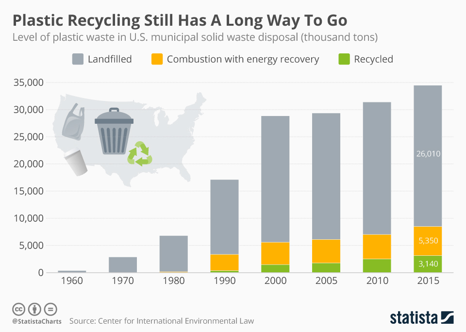
To create visual storytelling through data, you first need some data and a means to tell the story. I decided to focus on plastic waste in the United States and found a bar graph from a 2019 study covering plastic recycling. The bar graph covered from 1960 to 2015, but for my data visualization, I decided to specifically focus on the 2015 data. The study found there was 34.5 million tons of plastic waste generated in the United States, and only 3.1 million was recycled (Muffett et all., 2019). Given that my topic was on plastic waste, I decided to use Lego bricks as a means to represent the data. I have 200 bricks (the set came with 201, but one brick was lost in the making of this project) to use to create the final visualization.
From there, the focus was on how best to represent the data visually. In Data Visualization 101: How to Design Charts and Graphs, you must understand and identify the certain story you want to tell with your data (HubSpot). From my data, and want to tell the story of plastic waste through the colorful Lego bricks. This also presents the data in a colorful variety, but at the same time directly shows the types of plastic waste. The colors also help further the story, given the use of green for the environment and recycling.
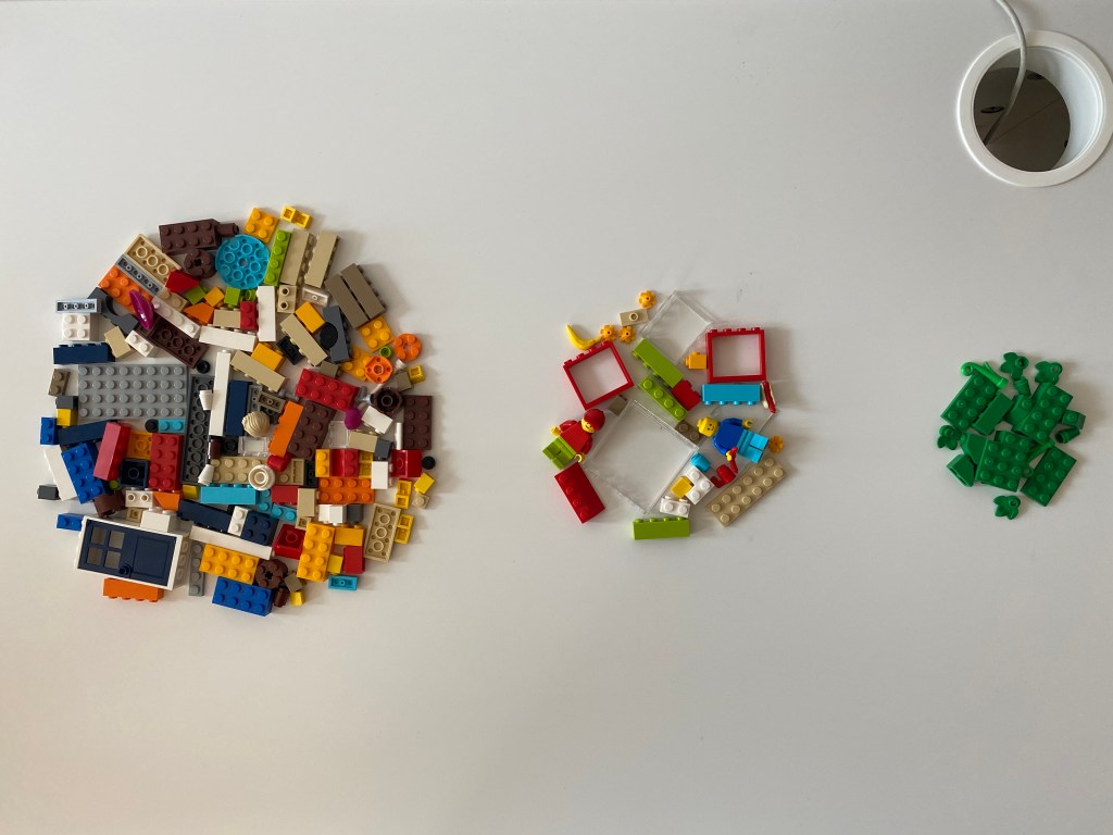
For my first data visualization, I sorted the Lego bricks into three categories (landfilled, combustion, and recycled) and put them into a bubble chart. While this helped to tell the story, it didn’t tell a cohesive story. I decided to resort to the bricks to match the color of the original graph and grouped the bricks into a pie chart. This better told the story of the data and has a different effect whether you are looking at it close up or far away. The organization was done following option two, with it grouped clockwise in descending order.
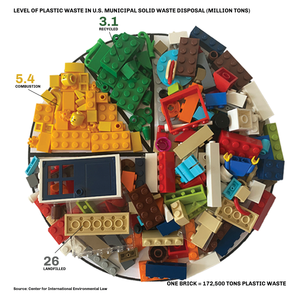
From there, I added description graphics to help clarify what this data visualization means if someone just saw this without the original data. To make the graphics more cohesive with the data visualization, I matched the font colors for the numbers to match the colors of the materials. I also added a small note to connect the amount of plastic waste to the bricks, to help further highlight the materials.
Coming to the final data visualization, there is a need to reexamine to see how effective it is at telling the story of the data. In What Makes a Good Visualization, McCandless further notes how the four important aspects of a good data visualization are information, story, goal, and visual form (McCandless). My visualization covers the four aspects in the following ways:
Information: Data from the 2019 report on plastic recycling
Story: Using Lego bricks to tell the story of plastic waste
Goal: A pie chart helps differentiate the different categories of plastic waste
Visual Form: The pile of Lego bricks as a representation of plastic waste
Overall, I’m happy with the evolution of my design and how well it is at telling the story of plastic waste through visualization. Comparing it to the original graph, it’s more colorful and has a lot more emotion. It’s important to take time to visualize data in unique and creative ways.
Works Cited:
Data Visualization 101: How to Design Charts and Graphs. HubSpot. (n.d.). https://cdn2.hubspot.net/hub/53/file-863940581-pdf/Data_Visualization_101_How_to_Design_Charts_and_Graphs.pdf.
McCandless, D. (2012, November 23). The beauty of data visualization – David McCandless. YouTube. https://www.youtube.com/watch?v=5Zg-C8AAIGg.
McCandless, D. (2020, November 21). What Makes A Good Data Visualization? Information is Beautiful. https://informationisbeautiful.net/visualizations/what-makes-a-good-data-visualization/.
McCarthy, N., & Richter, F. (2019, May 21). Infographic: Plastic Recycling Still Has A Long Way To Go. Statista Infographics. https://www.statista.com/chart/18064/plastic-waste-in-the-us-municipal-solid-waste-disposal/.
Muffett, C., Bernhardt, C., Kelso, M., Moon, D., Labbe-Bellas, R., & Hernandez, V. (2019, May 15). Sweeping New Report on Global Environmental Impact of Plastics Reveals Severe Damage to Climate. Center for International Environmental Law. https://www.ciel.org/news/plasticandclimate/.

Leave a comment