In understanding the viewpoint of your website’s users, it’s important to get their perspective on how they use and navigate the website. To do this, one research method can be used in usability testing.
In usability testing, a group of participants is given a list of tasks to complete by navigating the website. The goal is to understand more about the website by getting an outside perspective on the design.
To learn more about the overall design and navigation for the New Beginnings Family Academy website, three participants were selected to take part in the usability testing. They were each asked their opinion on the overall design of the homepage and given five tasks to complete. The tasks put them in the shoes of a variety of users, from a parent, donor, or volunteer.
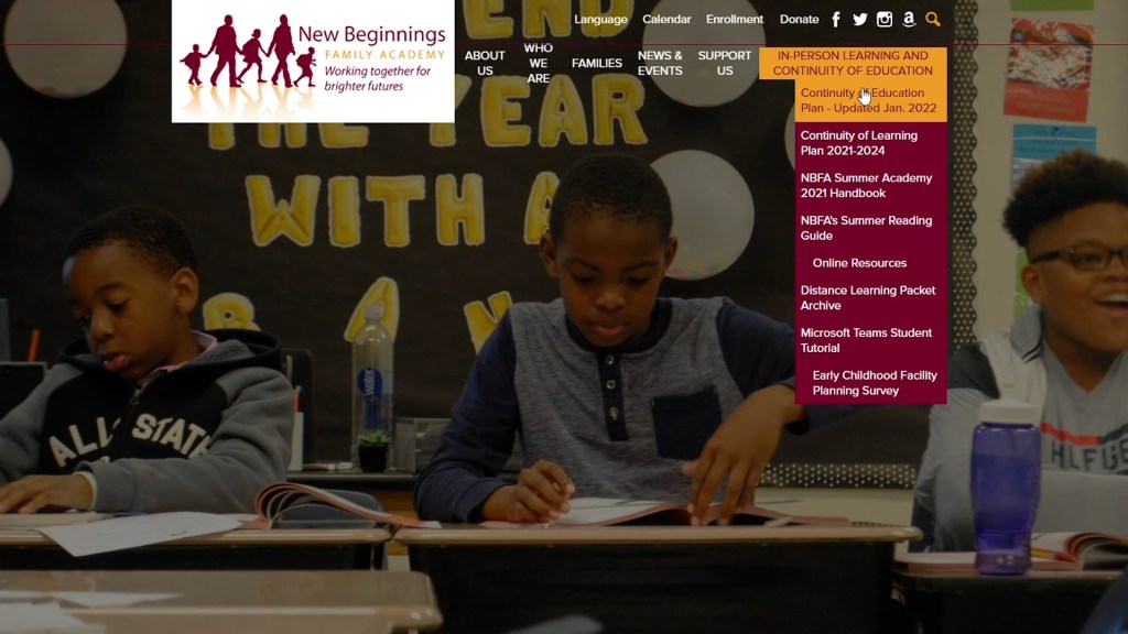
All of the participants were able to determine the core function and use case for the website, to promote the school and share resources with parents. Participant Three highlighted the centered design, and that it would be easy to view the website on a smartphone. Participant two noted that they enjoyed the large photos of students on the homepage, however, they found the gallery scrolled too quickly. All of the participants noted that the red line goes through the Who We Are section title, and found that bothersome.
For each of the tasks, all of the participants had difficulty navigating to where they felt the information should be to find the information. They would tend to be looking in the wrong section, or not able to judge from the page titles that it had the correct information. The design of the navigation bar also lead to some difficulty, in that it was too busy to discern the section titles.
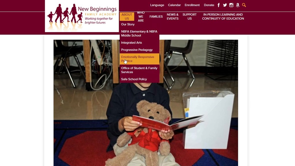
One highlight was the variety of ways that participants went about finding information. For example, two of the participants found information on volunteers by going to the Support Us section. However, the remaining participant found the information on mentors by going to the Who We Are section.
From the usability testing, some problems areas were addressed. On the homepage, the red line going through the text of the Who We Are section was a major distraction. The complete organization of the navigation bar was a problem for the participants, as it took a lot of time for them to find the correct pages. This confusion left them frustrated, which is the opposite of what a good website design should do. Another problem area was the inability to find the video gallery section, which is important given a major push on the website is to help show what is going on in the school.
Overall, from the testing each of the participants found the website to be functional and were able to find the information in time. However, will observing the participants I was able to see they were frustrated in not finding the correct pages in time.

Leave a comment