While you may not realize it, visual storytelling is an integral part of our lives. To put it simply, visual storytelling is a story primarily told through visuals. In Visual Storytelling, Andrew Losowsky explains visual storytelling as a “combination of emotional reaction and narrative information” (Losowsky 1). From how colors are selected for an advertisement or the way a photograph is taken, visual storytelling helps connect our emotions to the narrative on display. Visual storytelling is an integral tool in the realm of journalism, with its ability to improve the quality of both the reporting and content. Through visual storytelling, journalism has changed in a significant way. WED, a philosophy of journalism, incorporates writing, editing, and design to create more effective journalism (Reason). While a century ago journalism meant dozens of stories in a newspaper written by a select group of writers, journalism now is a multi-faceted digital approach where visuals are just as important as the text. A growing subset in the journalism industry is data journalism, which involves using data to tell stories. What is important about data journalism is how it allows a journalist to tell engaging and complicated stories through data visualizations (Gray et al. 2). These visualizations help the audience understand complex data topics, but require more care to be effective. How we use visual storytelling to report on data is important, and has a profound impact on the work newsrooms can do.
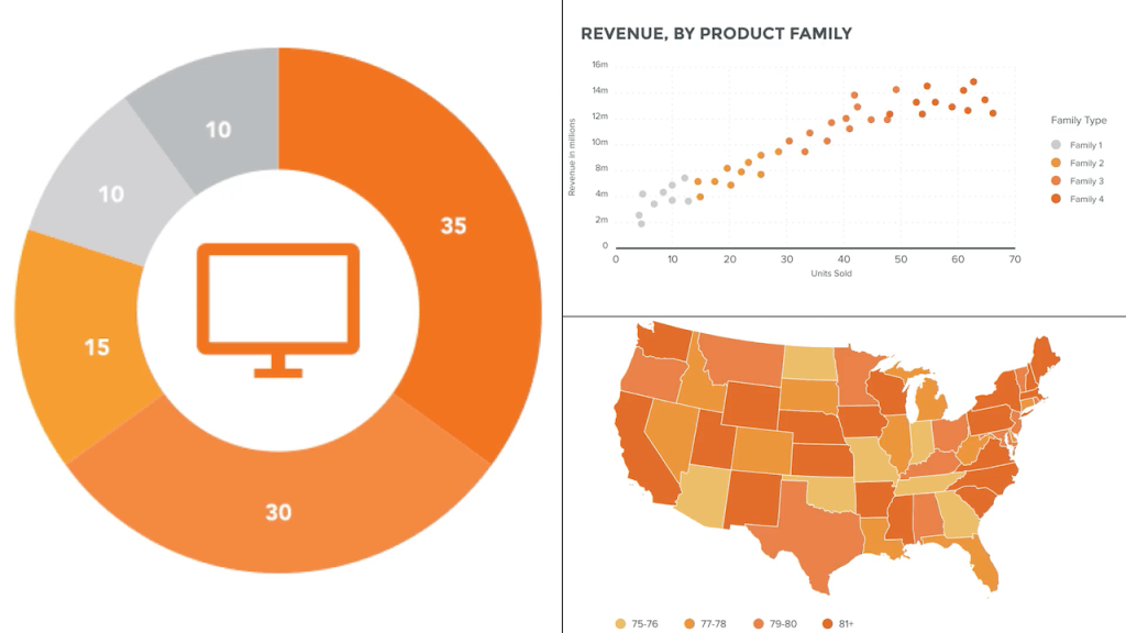
Data journalism is about telling stories with data, but what’s also imperative is the data visualizations themselves. The way they are constructed and presented can severely impact how easily the data can be communicated to the audience. Before understanding visual storytelling in data journalism, it’s important to understand the fundamentals of data visualizations. Data can be visualized in a variety of ways, and it is important to find the right visualization that fits the data. There are numerous types of data, from qualitative, continuous, discrete, and categorial that can be presented in even more ways (Hubspot). The most common ways to visualize data are bar or pie charts, but journalists also use bubble charts and heat maps to better fit their stories. Another important factor when it comes to data visualizations is the design itself, as to not confuse the audience and allow them to understand the data they are seeing.
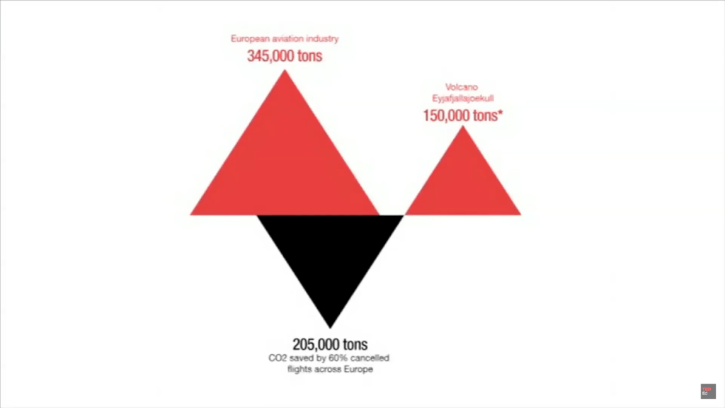
David McCandless, in his TED Talk The Beauty of Data Visualization, highlighted the need for proper data visualization as it allows for the audience to “start to see patterns and connections between the numbers” (McCandless). When discussing topics such as the economy, climate change, or even distances, it can be difficult for audiences to comprehend large numbers. By creating data visualizations, eases the burden on the audience and allows for a broader discussion on the topic. McCandless uses the example of data visualization of whether or not there was more CO2 emitted per day from planes or the Icelandic volcano eruption in 2010. For the data, there were around 150,000 tons of CO2 emitted from the volcano eruption while there were 345,000 tons of CO2 emitted from the European aviation industry. Thus, there was a 60% cancellation in the CO2 emitted due to the volcano forcing planes to the ground and thus unable to emit more CO2. Those numbers can be difficult to understand just by reading them, but McCandless visualizes the data in a slick and easy to comprehend way. With just three triangles and two colors, the staggering amount of CO2 emitted can be compared and contrasted simply. No matter who the audience is, they can understand the data and the story told through data.
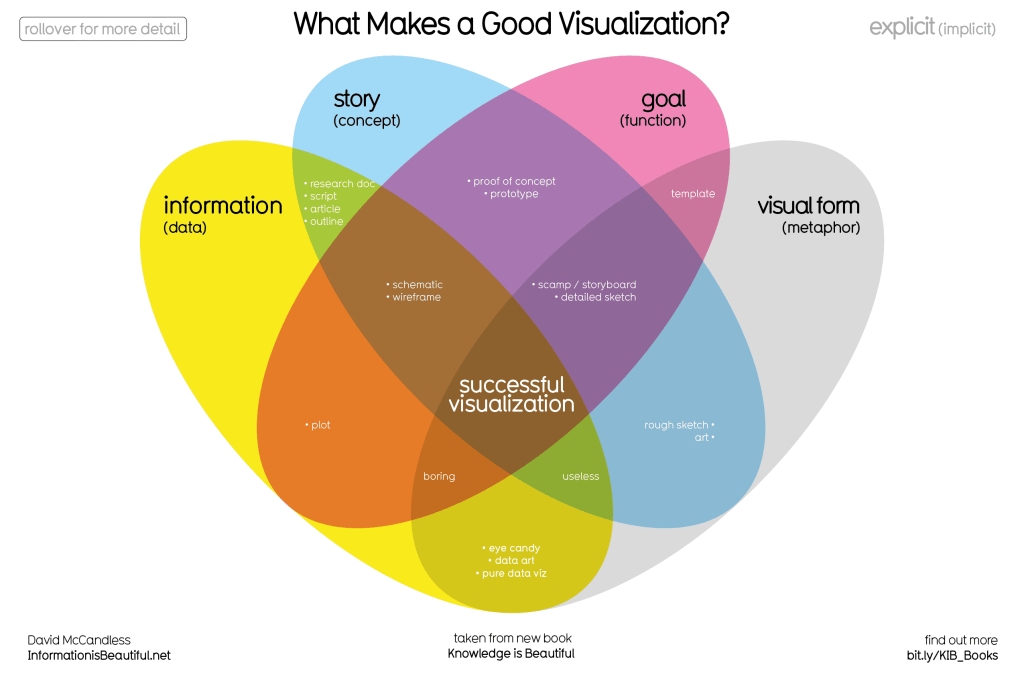
For a data visualization to be effective, a lot of effort is put in to make it present the data and connect the story. McCandless breaks down that a good visualization requires information, story, goal, and visual form (McCandless). The data must be accurate as if it is not the audience will not trust the visualization. For the story, it must have a strong concept that is newsworthy and connects with the audience. The data visualization has to function well for the overall concept, and not feel out of place. Importantly, the visualization must be nice to look at and be made with care. Even if the information is solid, newsworthy, and functions well, if it is an eyesore it will falter with the audience. A good data visualization will do well in each of the four pillars. For a journalist, their work matches the same bars that are required for a good data visualization. Their work must be newsworthy, trustworthy, useable, and be created with care. Given this, it is easy to understand why the two go so well together. Data journalism can be enhanced through data visualizations with proper visual storytelling.
When it comes to data journalism, visual storytelling can help propel the effectiveness of the reporting. Data visualizations can be used in combination with reporting to enhance visual storytelling. Helping readers to understand complex topics is important, and is why effective data journalism is needed. Given the drab nature of how data can be, it is important to create visuals that engage the audience. To aid the process, “storytelling and narrative techniques are being currently used with data visualization to leverage the power of visual expression.” (Rodríguez, M. et al.). Thanks to visual storytelling, journalists can leverage its capabilities to help readers gain a deeper understanding. Data is a critical part of this process and must be used appropriately. As data journalism has become a more used tool in newsrooms, visual storytelling has been implemented to help aid the data visualizations in the reporting. Visual storytelling in data journalism is used in several ways, from explaining the global pandemic of COVID-19 to presenting the toxic waste sites littered around the United States.
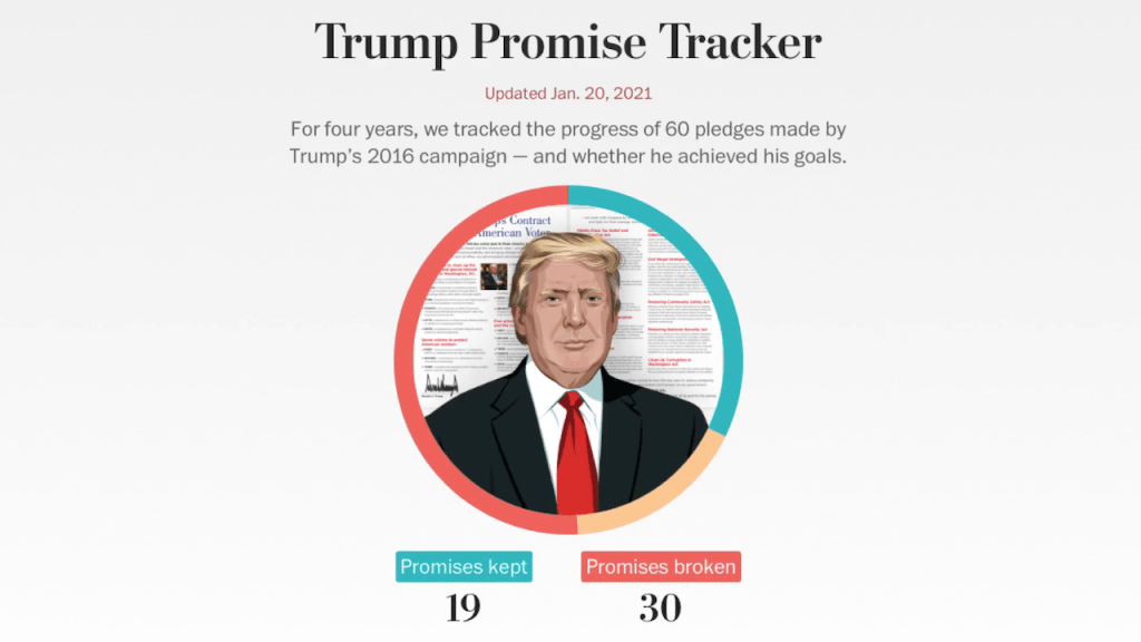
The Washington Post, in the data visualization Trump Promise Tracker, tracked the various promises made by President Trump. The data visualization is easy to comprehend, allowing for the audience to see how effective the President was during his time in office without the fluff (WP Company). It allows the reader to interact and sort the different data along with a donut pie chart at the top that breaks down the data. It has a clear and crisp style, with each color signifying a different outcome of a promise. The Trump Promise Tracker allows for the audience to have a more well-rounded examination of the promises made by the president and uses a variety of data visualizations to highlight the storytelling.
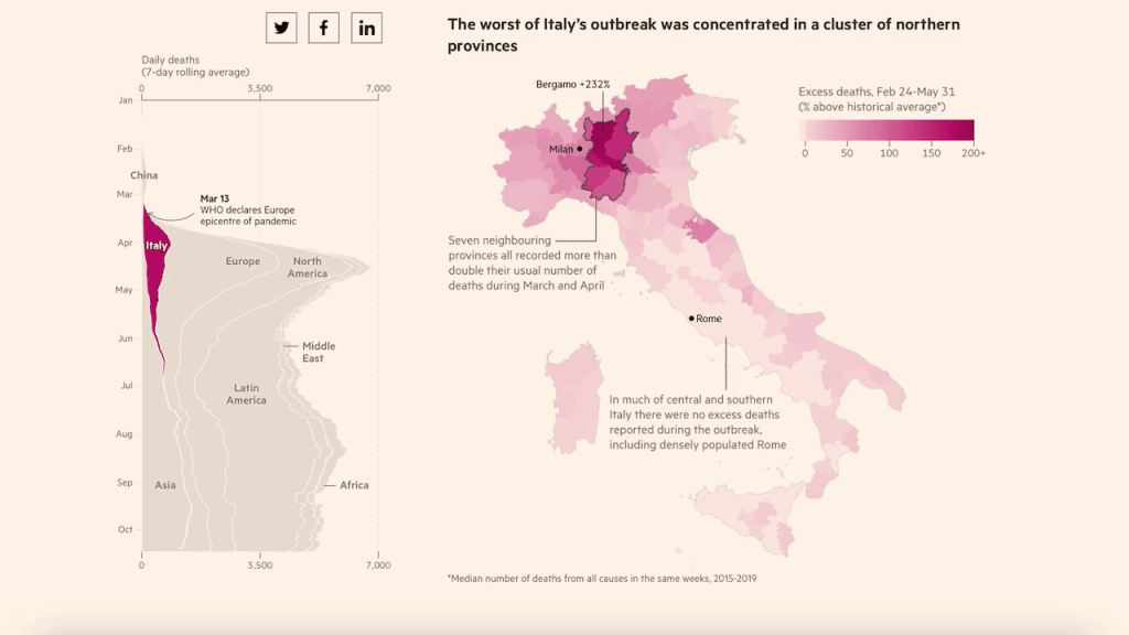
Given how enormous the COVID-19 pandemic was on our lives, thinking back on the past year in terms of deaths can be difficult. The Financial Times created a data visualization timeline that broke down the past year of the COVID-19 pandemic. As a user scrolls down the page, they can view through a variety of different data visualizations on COVID cases across the globe (FT Visual & Data Journalism team). The visualizations help tell the story of the pandemic and allow the audience to understand the magnitude of the situation. The visual storytelling hits home the gravity of the deaths that occurred due to COVID, and how each country around the world was impacted by this situation. It also emphasizes that there will be lasting consequences of the pandemic for years to come.
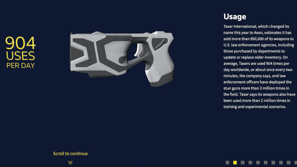
As police brutality has become a rising issue in the last few years, one symbol of that has become the taser and its use by law enforcement agencies. Reuters Graphics created a data visualization breaking down how tasers function and how it is used. It allows the user to scroll through multiple slides on usage, cartridges, and oversight implementations (Reuters Graphics). As a journalist, it’s important to cover even the most minute details of a story to help given a broader outlook to audiences on complex issues. While this visualization helps address the small details on tasers and how they function, it is lacking in how it presents the quantitative data.
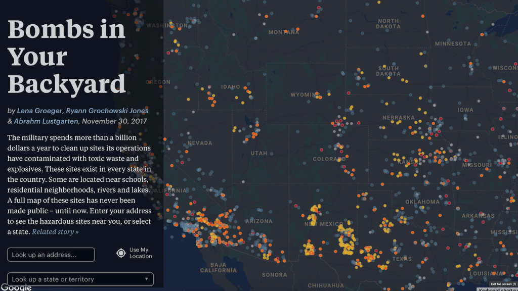
Another important factor in journalism is helping to educate the public on a concerning issue they might not be aware of. ProPublica put out a data visualization using Google Maps to track toxic waste and explosive sites around the United States. The data visualization allows for the user to interact and search a specific address, or look up a certain state or territory. Not only does this allow for the general public to be aware of toxic sites that might be in their backyard, but it also educates the public on how much the government has spent on clean-up on these spaces. If this data was presented in a spreadsheet or a standard article, it would not be as effective to the audience as a data visualization.
With each of these visualizations, they craft data journalism with visual storytelling to tell a compelling story. These visualizations also are meant to help educate the public and allow for interactivity to help the audience sort through the data. They are also well-crafted to make them look visually pleasing as well, to not take away from the data. Creating effective data visualizations through visual storytelling requires a lot of effort, and a team of creators in the newsroom to make it happen.

As newsrooms have shifted towards data journalism, an important aspect to consider is how journalism has changed. No longer does journalism constitute a standard newspapers with dozens of text-only stories. Now, newsrooms are made up of writers, editors, designers, programmers, and even statisticians. This process has involved new productions methods to create the multi-media digital journalism expected today. One might expect that given the variety of creators in the process, it would complicate the reporting that was published. However, the crucial factor of the process of data journalism is that everyone involved keeps a journalist mindset (Weber, W. et all). Even with the variety of hands involved in the process, it is important to think about the whole of data journalism as a journalist.
As data journalism becomes a more popular form of reporting, it will require a variety of creators each bringing their skills to the table. However, a crucial topic is what makes one piece of data journalism better than another. Given how new this sphere of journalism is, there is no set of accepted standards for what one considers excellent data journalism. Most data journalism pieces fall under dynamic maps, graphs, and video with interactive elements to help inspect and filter (Lynn Young). Another issue is how free tools such as Google Maps are not customizable for someone not familiar with the tools. As data journalism continues to be implemented in newsrooms around the world, there must be consistent guidelines for what constitutes solid data journalism. The tools also need to become more widely used and accessible, to allow more people to engage in the opportunities of data journalism. Once that is done, there can be consistent visual storytelling we can judge and compare in the data visualizations. Another factor that is also important to consider in visual storytelling in data journalism is having strong ethics in the visuals that are created.
As a journalist, they must have strong ethics and not report on the news in a way that can mislead the audience. If not, the audience will not trust their work, especially if it reporting on complex and newsworthy topics. Misleading in visual storytelling can happen in several ways, from over-editing a photograph to creating data visualizations that tell a different story from what the data shows. In the Society of Professional Journalists Code of Ethics, two major focal points are to “Seek Truth and Report It” and “Minimize Harm” (SPJ). Having strong media ethics is important, as it allows the audience to trust what they are reporting on. Misleading visuals both do not tell the truth and can cause harm depending on how severe it is.
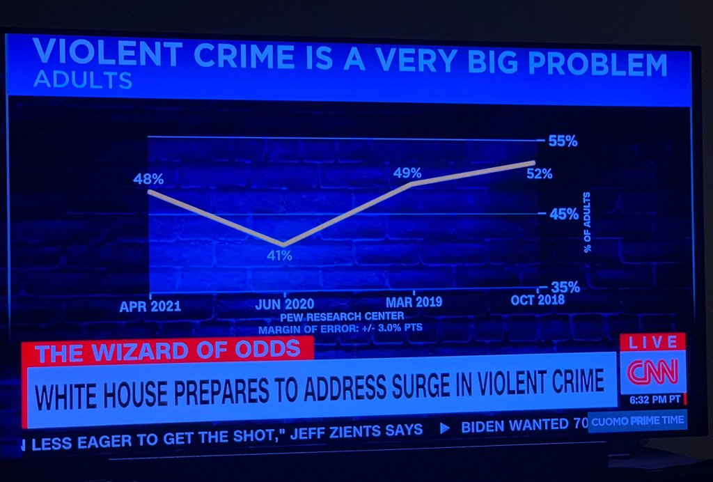
CNN had a story on the White House preparing to tackle a “surge in violent crime” in the United States. To go with that story, there was a data visualization with the caption Violent Crime is a Big Problem, with a line chart showing a rise from 48% to 52% (CNN). However, the X-axis on the chart was flipped, which shows a decline from 52% to 48% from 2018 to 2021. Even though the data presented a decline in crime, CNN decided to flip the chart so it fits better with their story. While not technically inaccurate, it is deceptive in that there is no clear why the X-axis has been flipped.
In How to Lie with Charts for the Harvard Business Review, the article presents different ways data visualizations can be manipulated. One example focuses on how we as humans assign metaphorical values to certain visuals in charts, as well as only include a segment of the X or Y-axis (Harvard Business Review). In the CNN crime visualization, the chart has been designed to show an upward trend, to make us feel scared of a supposed “rise in crime”. The X-axis also only shows four years, while if you broaden the length of time it shows a progressive decline in crime over the past decades. Misrepresenting the data of a serious issue though the visuals can have massive repercussions for a journalism outlet, as it calls into question their ethics and motivations. Especially coming from CNN, which is regarded as a trustworthy news source by the general public. Care must be taken to create visuals that both report the truth of the data and minimize harm.
Journalism is an ever-evolving industry, and data journalism has been a crucial tool to help newsrooms explain complex topics to their audiences. Not only do data visualizations require strong data and solid concept, but it also requires put into making it look pleasing to the audience. If not, data journalism and visual storytelling will not be as effective. Whether it’s the enormity of COVID deaths or the confusing promises of President Trump, data visualizations ease the burden on the audience to understand what they are reading. From there, they can focus on the story and make connections to the overall impact of the data.
Visual storytelling also allows us to connect our emotions to the data on display. Data journalism will continue to be implemented in the future, so it is necessary to implement strong guidelines and easy-to-use tools so journalists are not barred from doing their data journalism. Also, no matter who is involved in the production process each member must keep a strong journalistic mindset. Journalism is about telling stories, and data can aid the storytelling process. Data journalism is not going away anytime soon, so emphasis must be put to craft visual storytelling to aid the reporting done.
Sources:
Losowsky, A. (2012). Introduction. In *Visual Storytelling: inspiring a new visual language*. essay, Gestalten-Verl.
*Data Visualization 101: How to Design Charts and Graphs*. HubSpot. (n.d.). https://cdn2.hubspot.net/hub/53/file-…
McCandless, D. (2012, November 23). *The beauty of data visualization – David McCandless*. YouTube. https://www.youtube.com/watch?v=5Zg-C…
McCandless, D. (2020, November 21). *What Makes A Good Data Visualization?* Information is Beautiful. https://informationisbeautiful.net/vi…
FT Visual & Data Journalism team. (2020, October 18). *Covid-19: The global crisis – in data*. Redirect to… FT visual journalism. https://ig.ft.com/coronavirus-global-…
Graphics, R. (n.d.). *Getting Inside Taser*. Reuters. http://fingfx.thomsonreuters.com/gfx/…
Gray, J., Bounegru, L., & Chambers, L. (2012). *The data journalism handbook: how journalists can use data to improve the news*. O’Reilly Media.
Grochowski Jones, R., Lustgarten, A., & Groeger, L. (n.d.). *Bombs in Your Backyard*. ProPublica. https://projects.propublica.org/bombs/.
Lynn Young, M., Hermida, A., & Fulda, J. (n.d.). *What Makes for Great Data Journalism?* Taylor & Francis. https://www.tandfonline.com/doi/abs/1…
NPR. (2019, February 11). *These are the standards of our journalism.* NPR. *https://www.npr.org/ethics*.
Reason, R. (2002, August 20). *WED: The Integration of Writing/Editing/Design*. Poynter. https://www.poynter.org/archive/2002/…
Rodríguez, M. T., Nunes, S., & Devezas, T. (2015, September 1). *Telling Stories with Data Visualization*. ACM Digital Library. https://dl.acm.org/doi/abs/10.1145/28…
Weber, W., & Rall, H. (n.d.). *Data Visualization in Online Journalism and Its Implications for the Production Process*. IEEE Xplore. https://ieeexplore.ieee.org/abstract/…
WP Company. (2021, January 20). *The Fact Checker’s guide to 60 campaign promises by President Trump*. The Washington Post. https://www.washingtonpost.com/graphi….
Spj. (n.d.). SPJ Code of Ethics – Society of Professional Journalists. Society of Professional Journalists – Improving and protecting journalism since 1909. https://www.spj.org/ethicscode.asp.
Vision Statement: How to Lie with Charts. Harvard Business Review. (2014, December 5). https://hbr.org/2014/12/vision-statement-how-to-lie-with-charts.

Leave a comment