One of the deadly sins of visual storytelling is misleading your audience with your visuals, especially in the realm of journalism. Misleading visuals can come in a variety of ways, from over-editing a photograph to changing a data visualization to better fit a narrative.
In the Society of Professional Journalists Code of Ethics, two major focal points are to “Seek Truth and Report It” and ” Minimize Harm”. Having strong media ethics is important, as it allows the audience to trust what you are reporting on. Misleading visuals both do not tell the truth and can cause harm depending on how severe it is.
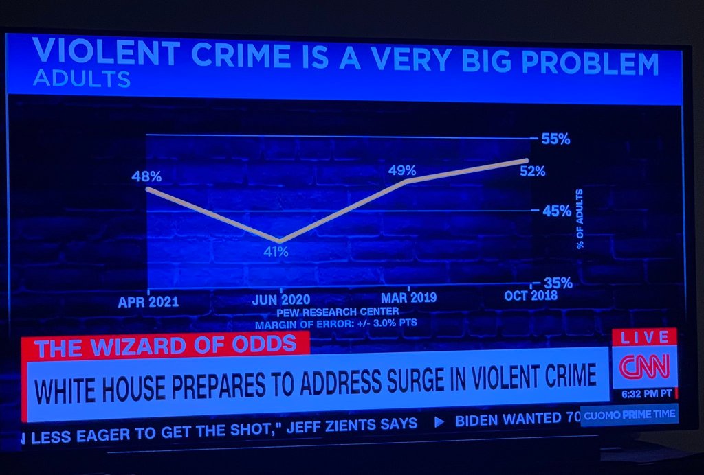
CNN recently had a story on the White House preparing to tackle a “surge in violent crime” in the United States. To go with that story, there was a data visualization with the caption “Violent Crime is a Really Big Problem,” with a line chart showing a rise from 48% to 52%. However, the X-axis on the chart was flipped, which shows a decline from 52% to 48% from 2018 to 2021. Even though the data presented a decline in crime, CNN decided to flip the chart so it fits better with their story. While not technically inaccurate, it feels deceptive in that there is no clear why the X-axis has been flipped.
In How to Lie with Charts for the Harvard Business Review, the article presents different ways data visualizations can be manipulated. One example focuses on how we as humans assign metaphorical values to certain visuals in charts, as well as only include a segment of the X or Y-axis. In the CNN crime visualization, the chart has been designed to show an upward trend, to make us feel scared of a supposed “rise in crime”. The X-axis also only shows four years, while if you broaden the length of time it shows a progressive decline in crime over the past decades.
Misrepresenting the data of a serious issue though the visuals can have massive repercussions for a journalism outlet, as it calls into question their ethics and motivations. Especially coming from CNN, which is regarded as a trustworthy news source by the general public. Care must be taken to create visuals that both report the truth of the data and minimize harm as well.
Works Cited:
Spj. (n.d.). SPJ Code of Ethics – Society of Professional Journalists. Society of Professional Journalists – Improving and protecting journalism since 1909. https://www.spj.org/ethicscode.asp.
Vision Statement: How to Lie with Charts. Harvard Business Review. (2014, December 5). https://hbr.org/2014/12/vision-statement-how-to-lie-with-charts.

Leave a comment