Summer is a time for barbecues, hanging out by the pool, and enjoying time in the sun with friends and family. Unfortunately, a massive heatwave is gripping the United States and causing temperatures to soar to triple-digits for days on end.
The heatwave is primarily being caused by heat done, which according to the NOAA is when “strong, high-pressure atmospheric conditions” create vast amounts of heat that are trapped. This problem is made worse by climate change, which can further the lengths and severity of heatwaves.
How visual storytellers present the heatwave is important, as it can educate the audience on the situation and show the people that are being impacted by it. Graphic design can be an important tool to educate people on complex topics through social media. This can primarily be done through data visualizations and photography.
Below are five examples of photography and data visualizations that emphasize the importance of good visual storytelling.
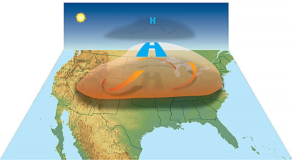
This visual graphic, from the NOAA, demonstrates how a heat dome is formed. Science Visualization, a website that focuses on how to best visualize scientific data, highlighted how “scientists overcome communications barriers through visual storytelling” (Science Visualization). Complicated scientific information is difficult for the general audience can be difficult, so visual storytellers need to relay this in an easy-to-understand way. The graphic helps to visualize how a heat dome can come about, and also shows the severity of how much of the United States can be impacted by it.
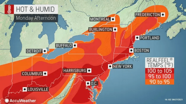
This data visualization, created by AccuWeather, presents the upcoming heatwave that will hit the northeastern United States. This type of data visualization is familiar to anyone who has watched a local news forecast. However, what stands out is the extreme temperatures presented and how they are shown visually. In Scientific Storytelling using Visualization, keeping in mind a narrative context can make a data visualization “more comprehensible, memorable, and credible to the general public” (Ma, K.-L. et al). For this data visualization, the narrative is the massive heatwave and how it will impact a wide variety of people.

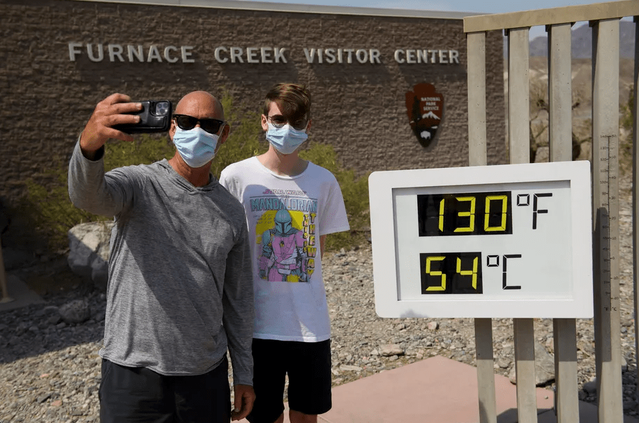
This photo, taken by Kyle Grillot, captures a couple walking in the background with a stop sign warning of extreme heat in the foreground. In NPR Ethics Handbook, the “purpose is to pursue the truth”, and this is not more important than in photojournalism (NPR). The focus here is to show the effects of the heatwave on a personal level, and how it could affect those that skirt warnings.
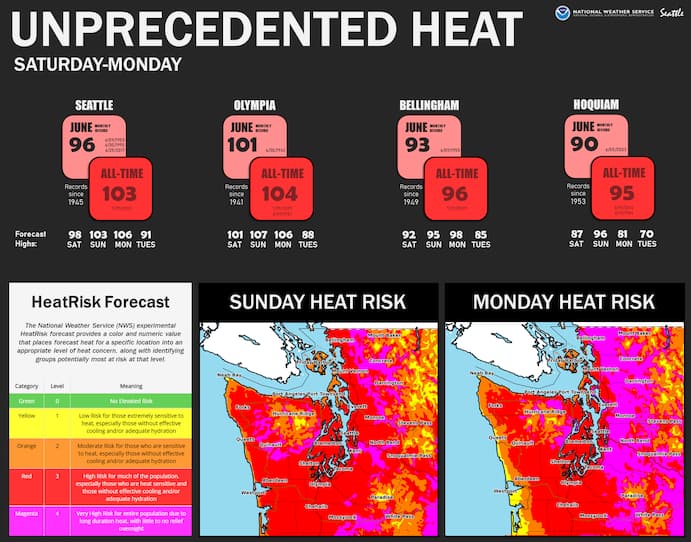
Created by the National Weather Service of Seattle, this data visualization presents the staggering heat wave that will affect the region. In creating data visualization, the four elements of data, concept, function, and metaphor are important for its success (McCandless). Without that, the visualization can not be as effective as it could be. This data visualization works well in presenting the data in a functional and digestible way. The graphic captures the severity of the heat and breaks down the risk for those living in the area. Bill Dennison, in the article Practical Visual Literacy for Science Communication, highlights how adding diversity and variety to data visualizations “enhances the appeal of science communication to a wide audience.” (Dennison). The image contains a variety of data visualizations that the audience can grab onto.

This photo, taken by Karen Ducey for Reuters, captures a fun moment of some children playing in a fountain. Given the severity of the heatwave issue, it is also important to remember the fun that can come at a dark time. It also highlights the childlike glee that can come from this time of year, and how climate change will soon come to affect it. In Multimedia Storytelling for Digital Communicators in a Multiplatform World, Gitner describes the notion of capturing a moment in photography. These moments can be fleeting but are also important in that they “are crucial to arousing emotion” in the audience (Gitner 7). If the photographer is not able to capture the exact moment of the child looking up and smiling, the photo is not as impactful as before.
In Visual Storytelling, Losowsky highlights visual storytelling as a “combination of emotional reaction and narrative information” (Losowsky 1). In covering an event such as a massive heatwave that is gripping the United States, how you present the information and the emotions that are tied to it are important. Not only does this present the human stories of those affected by the extreme conditions, but an important note is also in educating the public on staying safe during this time. As extreme heatwaves become more of a common aspect of life because of climate change, keeping the public informed on the issue through strong visual storytelling will become more important than ever.
Works Cited:
Dennison, B. (n.d.). Practical visual literacy for science communication. Integration and Application Network. https://ian.umces.edu/blog/practical-visual-literacy-for-science-communication/.
Science Visualization. (n.d.). http://sciencevisualization.com/.
Ma, K.-L., Liao, I., Frazier, J., Hauser, H., & Kostis, H.-N. (n.d.). Scientific Storytelling using Visualization.
Gitner, S. (2016). In What Ways Do We Think about Visual Storytelling Every Day. In Multimedia storytelling for digital communicators in a multiplatform world (pp. 1–33). essay, Routledge.
McCandless, D. (2020, November 21). What Makes A Good Data Visualization? Information is Beautiful. https://informationisbeautiful.net/visualizations/what-makes-a-good-data-visualization/.
NPR. (2019, February 11). These are the standards of our journalism. NPR. https://www.npr.org/ethics.

Leave a comment