Emotion plays a major part in how we take in visual design. From what colors or fonts are used to how a page is laid out, even the most insignificant detail can have major ramifications on how an audience perceives the design. To understand how website designers take into account visual storytelling and emotion, I took a look at Patagonia‘s website. First, I examined how the designers composed their web pages and created a mood board to break down the different means of design.
In terms of the overall design, Patagonia’s website is very sleek and crisp. It primarily uses white and black for the main design, along with videos and photos incorporated into the main page. Along with the black and white, the page also uses an off-gray to differentiate their articles from their products. The design helps the eye focus on what the designers want the viewer to see, which are the products and the photography.
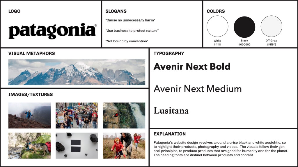
In Web design’s color theory: how to create the right emotions with color in web design, Jerry Cao breaks down how different colors express different emotions in design. Patagonia has chosen white and black as their primary colors to emphasize the sophistication and simplicity of the brand and design.Patagonia uniquely uses different fonts. In Fonts & Feelings: Does Typography Connote Emotions?, Sophia Bernazzani looks at how different fonts express different feelings in an audience. A Sans serif font is easier to read, so it is used in website design to aid readability. Patagonia primarily uses the font Avenir Next as it makes the process of reading product descriptions easier. However, for their articles and activism pages they use Lusitana, a serif font. Not only does it help differentiate it from the product pages, but it also adds a sense of maturity to those specific pages.
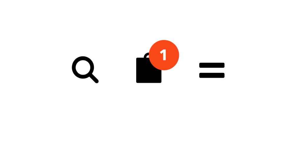
Along with their overall design, Patagonia’s website layout emphasizes simplicity and usability. The Gestalt principles describe how we perceive different visuals as being part of the same set. Patagonia primarily uses the Gestalt principles of similarity and closure in their design. Similarity indicates that objects that look the same belong to the same group, while closure indicates that elements are the same even if it is incomplete (Busche).
At the top of the page, there are options for Shop, Activism, Sports, and Stories. Each is the same in size, font, and spacing, so we perceive them as together. The upper right has more icons, but given that they are in a different style and spacing, we do not perceive them as together with the first set. The second set also features a shopping bag, which is covered with an orange circle after adding an item. Even though the icon is covered, there is still enough left for the audience to understand that it is a shopping bag.
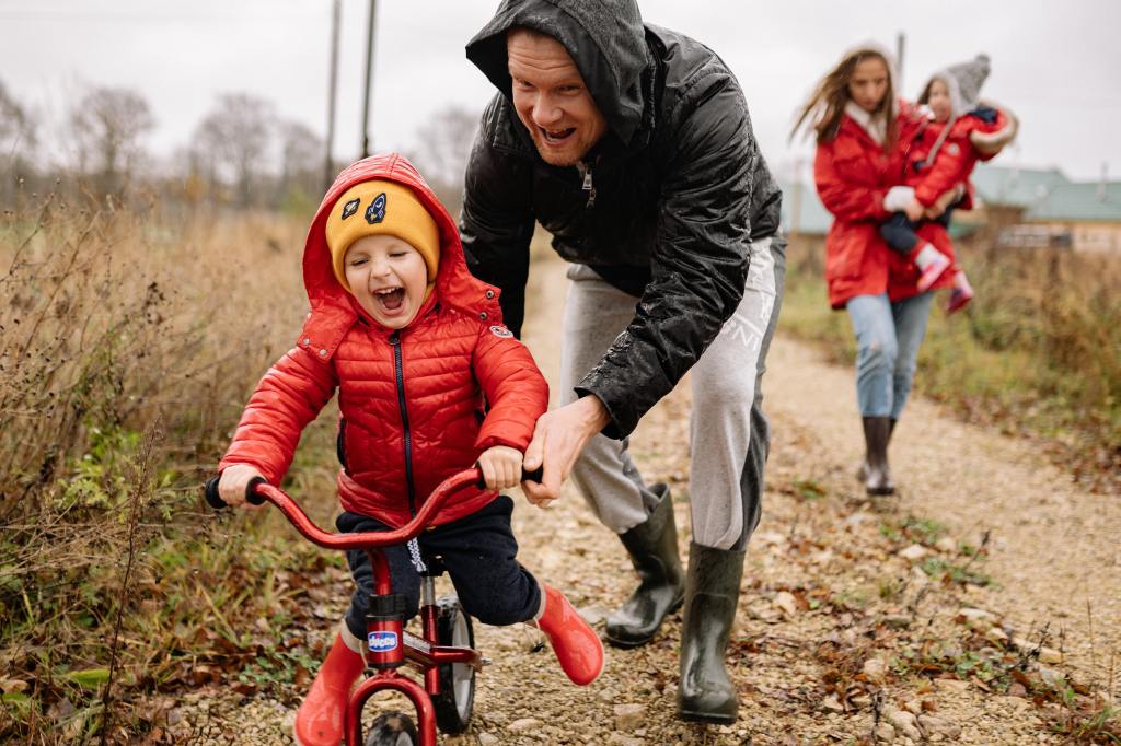
After analyzing the different visual design principles, I compiled the mood board to better understand how the designer thought out their design. Following the Patagonia style, I laid out my mood board in a simplified style. Through breaking down the design, it helped me to get a greater perspective on how the design can convey feeling in the audience. For example, looking for photos that conveyed the spirit of the brand, surprised me how the photography on the main page does not feel like other brands. Instead of models in a stark white background, the photography feels like it is capturing a moment. This helps to add to the authenticity of the product and the brand, as they promote it with relatable photos.
Patagonia’s visual storytelling is conveyed through its website design. If you did not know what their company was about, you could still understand that they are concerned with creating products that are good for people and the planet. While they have a simplistic style, it is used to convey key emotions and highlight the authenticity of the brand.
Works Cited:
Bernazzani, S. (2018, April 18). Fonts & Feelings: Does Typography Connote Emotions? HubSpot Blog. https://blog.hubspot.com/marketing/typography-emotions.
Bonner, C. (2019, March 23). Using Gestalt Principles for Natural Interactions. thoughtbot. https://thoughtbot.com/blog/gestalt-principles.
Busche, L. (n.d.). Simplicity, symmetry and more: Gestalt theory and the design principles it gave birth to. Canva. https://www.canva.com/learn/gestalt-theory/.
Cao, J. (2021, April 27). Web design color theory: how to create the right emotions with color in web design. TNW | Tnw. https://thenextweb.com/news/how-to-create-the-right-emotions-with-color-in-web-design.

Leave a comment