
Even in our digital world, a brochure is still an effective means to communicate a message. Whether that is a charity event, school project, or business proposal, a brochure can highlight your goals clearly and concisely. For this assignment, I had to create a brochure for a fictional travel agency. For my brochure, I decided to create a travel agency that highlighted hiking spots around Connecticut.
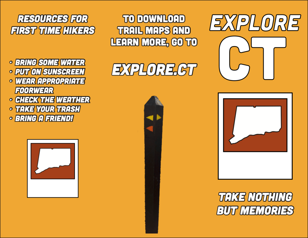
To begin, I sketched out my design and what goals I hoped to accomplish. The brochure would help promote different parks around Connecticut and highlight the fun of outdoor hiking. For my travel agency, I created the name Explore CT and made a graphic of a polaroid with a shape of Connecticut inside of it. The tagline “Take Nothing But Memories” harkens back to the signs one would see around parks, but shifts it back to the fun memories people make out on hikes.
In Graphic Design Solutions, Landa highlights how in communicating information, a brochure can be text-driven or image-driven. For my brochure, it is text-driven. Even though it is text-driven, there are still images and graphics to support the text and help illustrate concepts. If this was a real promotion, I could see my brochure being passed out at schools or businesses to help drive tourism to parks. This promotion also works for locals to help remind them of the wonderful parks they have around them.
For my color scheme, I went with deep yellow, orange, white and black. I wanted the colors to evoke the colors of a sunset that one would see while they are out on a hike. For my font, I selected Cubano because it is quite bold yet has a fun roundness to it. It also evokes the feeling that one would see this type of font on a sign at a park. I mixed between the regular and italic font to help differentiate between sets of text. To help create depth, I made each of the pictures look as if they are inside a polaroid picture.
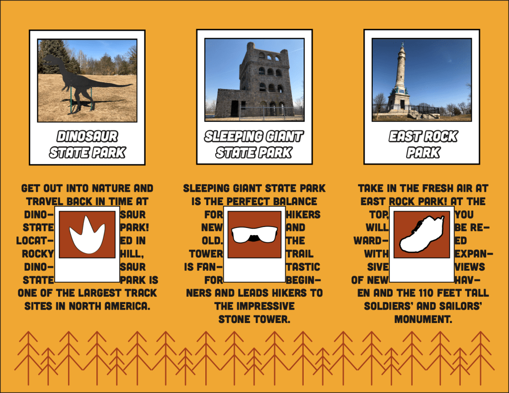
To break up the text, I used the wrapping text technique. I created a set of icons for hiking (a dinosaur footprint, sunglasses, hiking boot) and made smaller versions of the polaroids. The text is wrapped around each of the polaroids and connects with the specific park. I found this very challenging to find the right way to wrap the image without disrupting a lot of the text.
To help connect the three inside columns, I created a graphic of trees and lined them on the inside. Before that, the columns felt lacking at the bottom and separate from the rest. With the lining at the bottom, it feels more cohesive.
With my brochure, I wanted to keep it simple and focus it on someone that either has not gone hiking before or does not see the benefit of it. Especially given how many people are inside due to the pandemic, going out for a hike is refreshing and safe given how spread out most parks are. I feel the brochure helps communicate the fun of exploring different parks, along with tips and recommendations for beginners.
Works Cited:
Landa, R. (2019). Graphic design solutions (6th ed.). Boston, MA: Cengage.
Dinosaur State Park home page. https://www.dinosaurstatepark.org/.
East Rock. New Haven, CT – East Rock. https://www.newhavenct.gov/gov/depts/parks/our_parks/east_rock.htm.
Sleeping giant state park. https://portal.ct.gov/DEEP/State-Parks/Parks/Sleeping-Giant-State-Park.

Leave a comment