In the creation of a website design, the form is just as important as function. A major problem is that most websites are bogged down with useless information or intense graphics. That can confuse users and leave them less inclined to reach out again.
For this assignment, the task was to create a website homepage design for a fictional company. To go with the website homepage, we must create a mobile page as well. I decided to follow the style and format of my fictional video game publisher, Simple Digital.
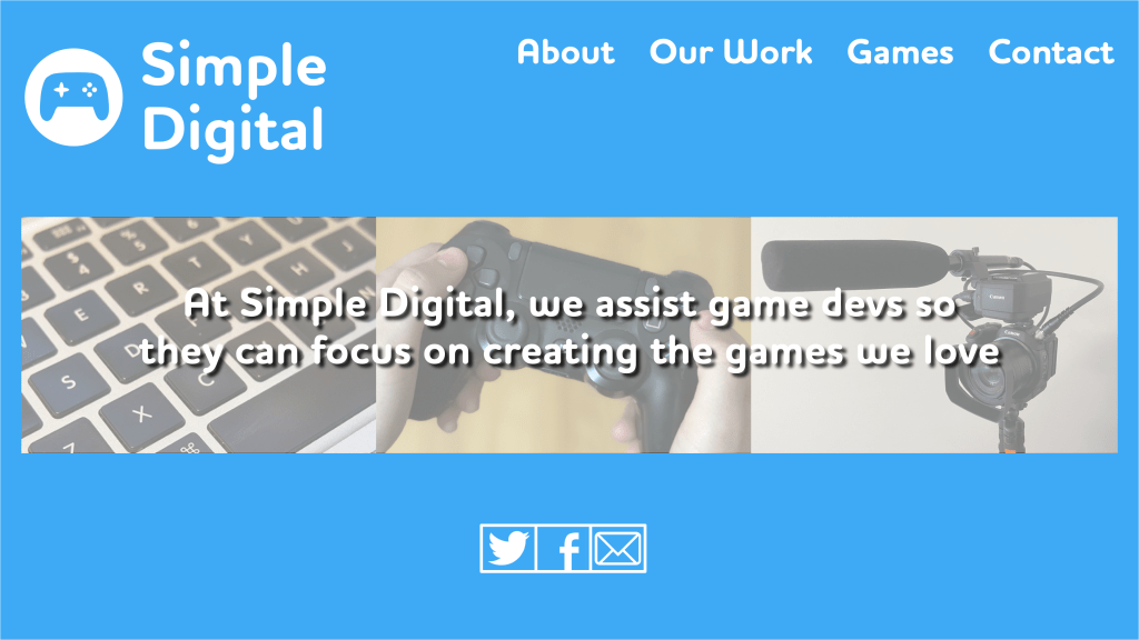
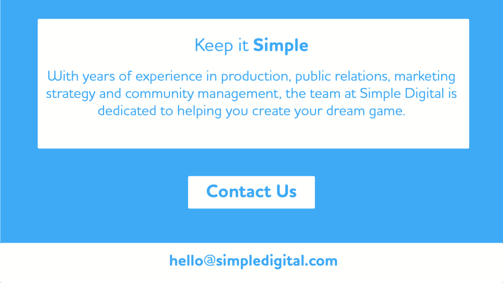
For the layout of my homepage, I broke it down into three sections. The main page, with the logo, navigation, images. The team page, with photos and descriptions of each of the team members at Simple Digital. Lastly, the contact page with a statement of the company’s goals with a contact section.

To go with my design, I followed the same template as my logo. My font is a rounded font to highlight the fun of play, and the color blue signifies calm and trust. I also used the tagline from my advertisement to help create a cohesive look for the website.
Following Graphic Design Solutions, one of the most important facets of a website design is that it “respects the user’s time and goals” (Lande 343). A key goal of mine was to make sure all the necessary information for someone to see was on the main page. The Anatomy of a Winning Website Design makes clear that the most important information in your website design needs to be above the fold, as most people are not inclined to keep scrolling (Cox). As soon as you open my main page, you know the goal of the company, along with photos and contact options. If the user keeps scrolling, they would then know who works for the company and a broader breakdown of their services. If they wish to go through the navigation at the top to get more information they can, but the most important information is available immediately.


Adjusting my website from desktop to mobile was quite a challenge. I had to reorganize a lot of the information and adjust the logo to help it better fit the page. In Four Key Principles of Mobile User Experience Design, Brown focuses on how the “design of mobile experiences must accommodate the user’s varying commitment and distributed attention” (Brown). With my design, I wanted a mobile user to immediately see the overall goal of my company and the information to contact them. If it is too complicated, the user can get distracted and not feel a need to return.
In terms of design, creating a homepage helps to understand the need to treat the user with respect so they can get the most out of what they are coming to see. If not, the design can complicate matters and risk alienating potential clients.
Works Cited:
Brown, D. R. (2009, November 19). Four Key Principles of Mobile User Experience Design. Boxes and Arrows. https://boxesandarrows.com/four-key-principles-of-mobile-user-experience-design/.
Cox, L. K. (2015, October 9). The Anatomy of a Winning Website Design [Infographic]. HubSpot Blog. https://blog.hubspot.com/marketing/anatomy-web-design.
Landa, R. (2019). Graphic design solutions (6th ed.). Boston, MA: Cengage.
 Bailey MeCey
Leave a comment