A company’s success can hinge on whether or not their logo communicates what makes them important. A logo expresses the purpose and message of the company and is then supported through additional marketing (Landa). For this assignment, I had to create a logo for a fictional company.
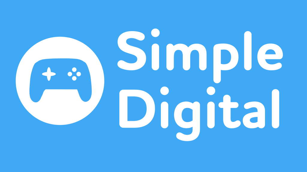
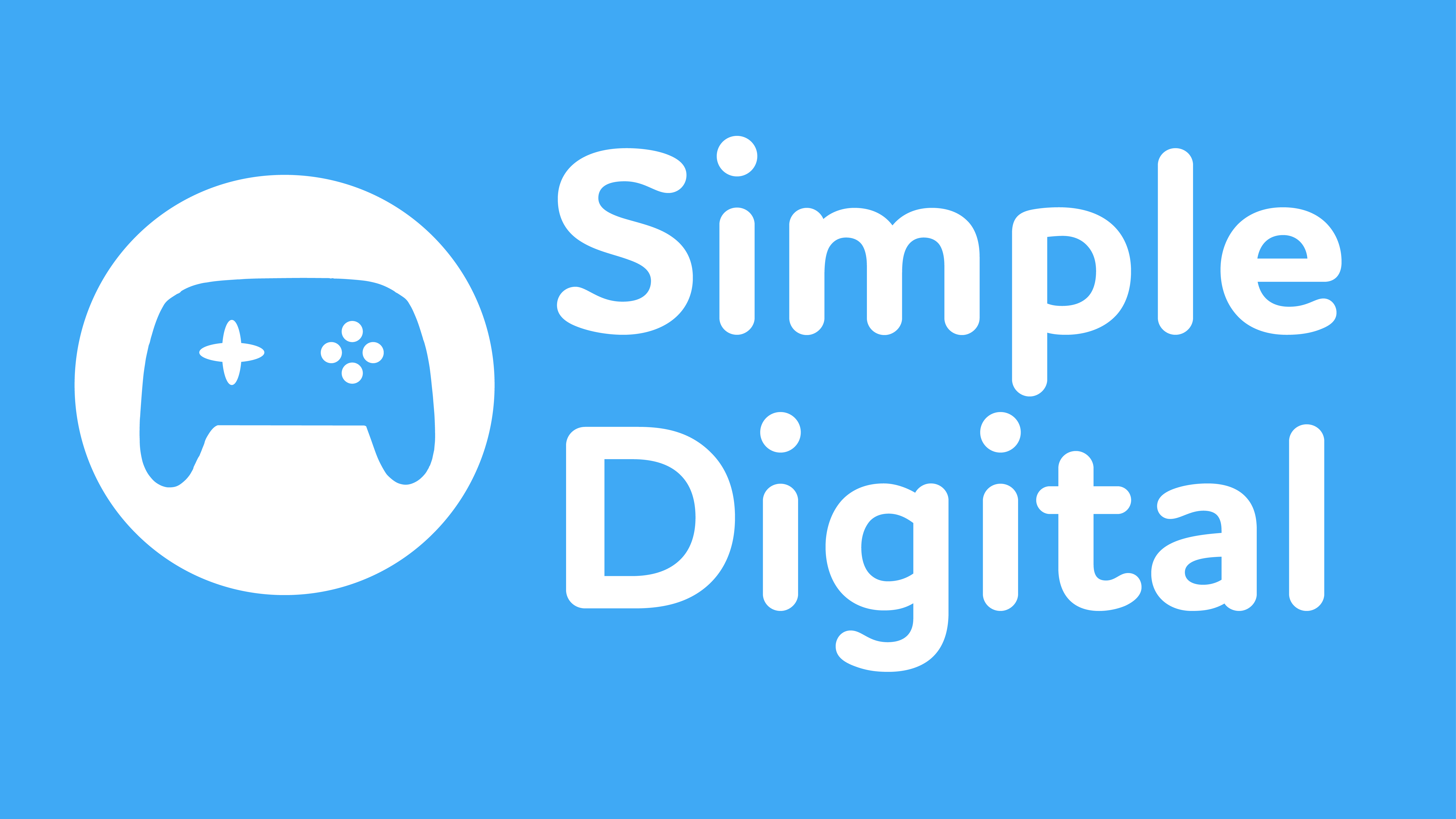
For my fictional company, I decided to go with an independent game publisher called Simple Digital. Video game development can be a hectic and intense process, so the focus of my company would be the ease in which it helps developers through the production of their game to release.
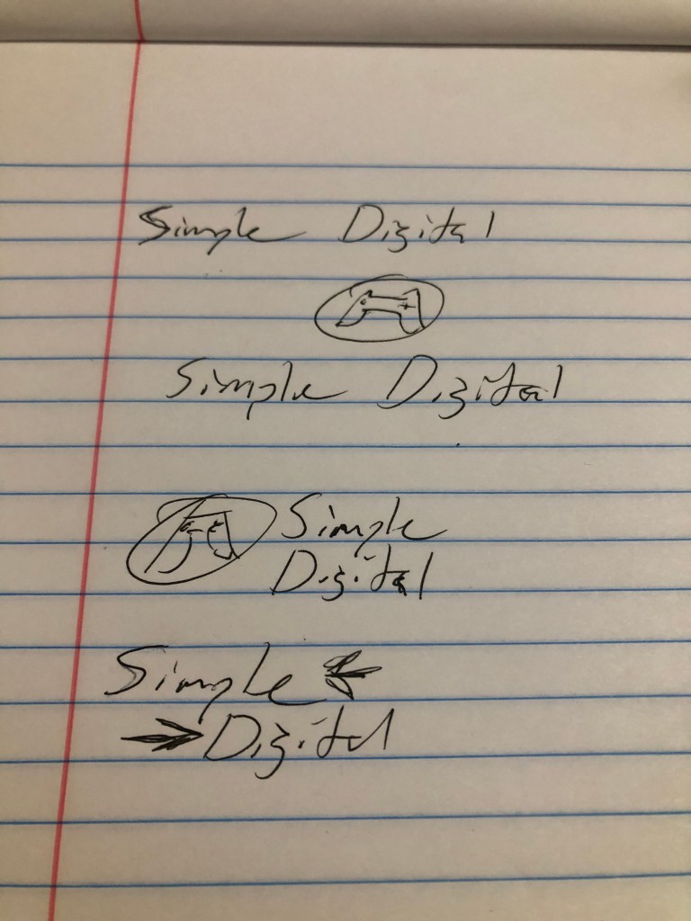
To help communicate that message, I wanted a logo that was playful yet clear. First, I looked for a font that expressed that sentiment. I choose Houschka Rounded as it had the playful energy I was looking for. I created two versions, with the text on the same line and the text stacked together. To go with the text, I created a mock controller silhouette in Illustrator.
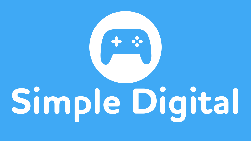
For my color scheme, I wanted to follow the message of my company and not have it be too wild with different colors. Given the purpose of my company is to help guide independent game developers, I wanted my colors to express the notion of calm and trust. According to color psychology, blue expresses and calming effect and instills trust. White can help give a design a sleek and modern look (Cox). I selected a light blue and white to show the trust and calm my company represents, but in a modern way. Something I found interesting was how well the colors worked reversed.
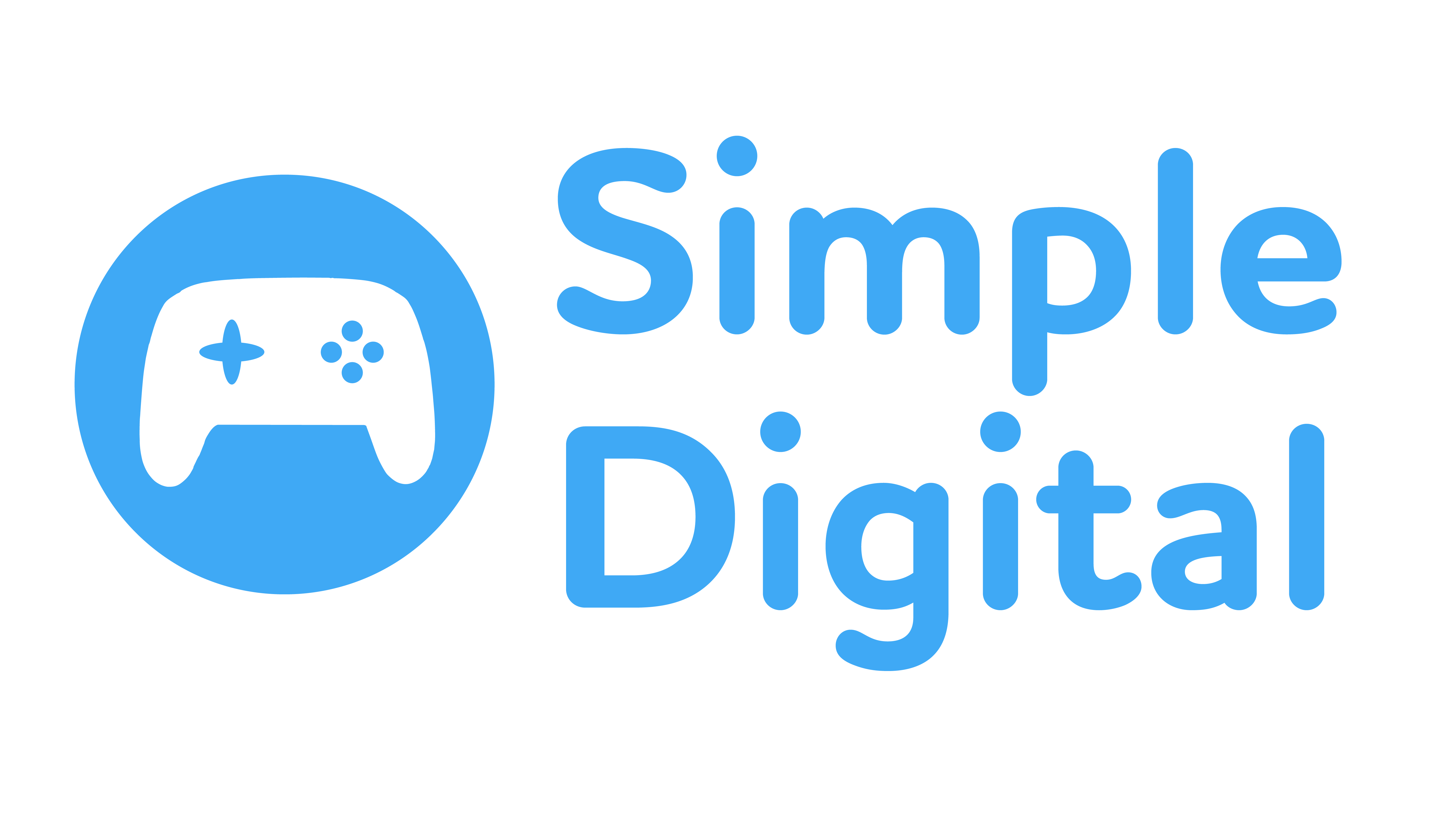
Through the design process, I wanted to do my best to keep my design playful yet sleek. My logo helps convey that it relates to gaming, yet does not scream it in an insulting way. My color scheme also helps express a sense of calm that my company would help bring to my clients.
Worked Cited
Landa, R. (2019). Graphic design solutions (6th ed.). Boston, MA: Cengage.

Leave a comment