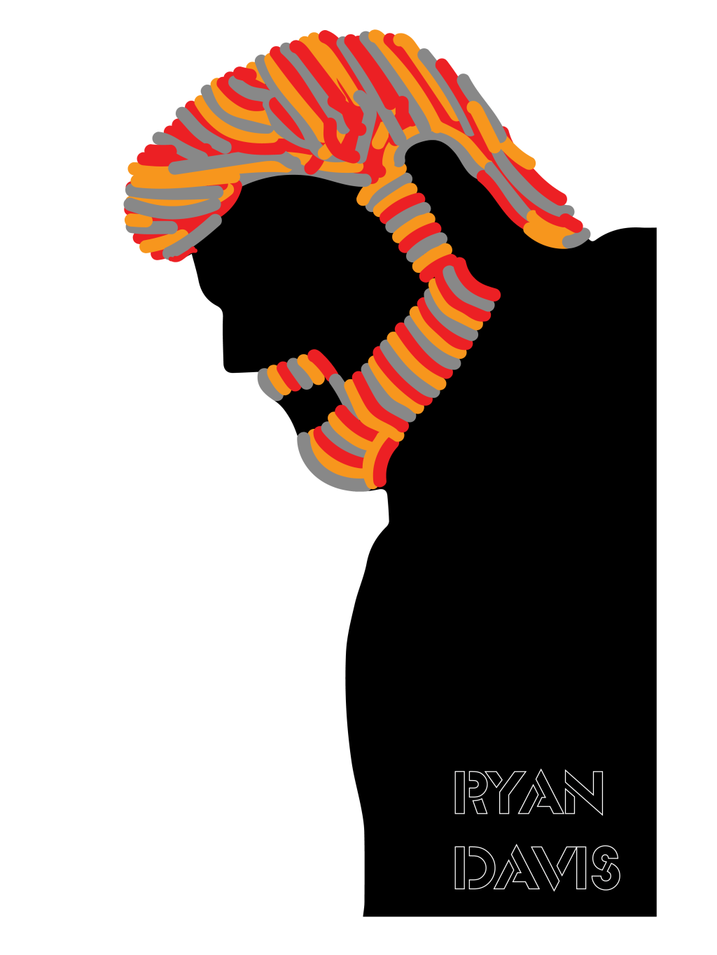
Continuing with our work on visual design, our task was to emulate the artistic style of Milton Glaser by “glaserizing” a photo. The photo is meant to be a photo of a hero of ours personally.
For my Milton Glaser rendition, I made a composition for my hero Ryan Davis. Ryan Davis was a writer and video games journalist who was one of the first people that made me interested in covering games professionally at a young age. He, unfortunately, died before I had the chance to meet him, so I wanted to create this as a tribute to him.
After selecting an image, I created a silhouette in Photoshop and exported it into Illustrator. From there, I drew out the hair and facial hair. For the facial hair, I did it in a more controlled style, but for the hair, I used a more chaotic style.


For the first image, I used the colors of the Giant Bomb logo, the video game website that Ryan founded. The colors of the logo are deep red, orange, grey, and white.
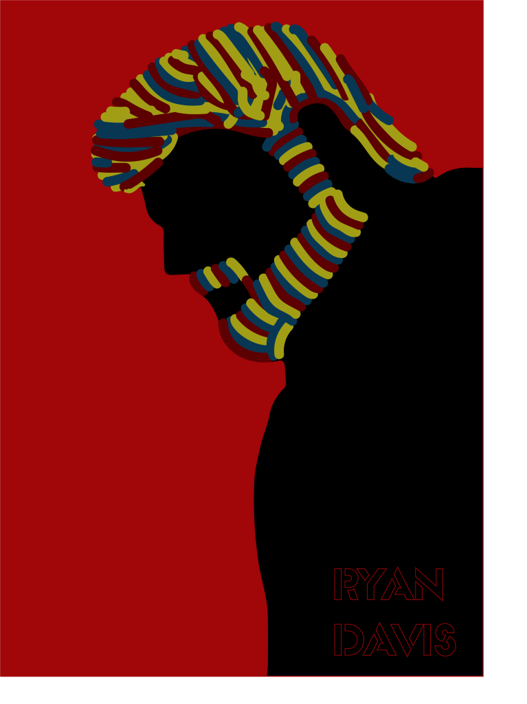
With the second image, I wanted to use more cool colors given the colors of the first image are bold. According to color psychology, blue has a calming effect and shows trust (Cox). Blue colors also make people feel confident and reliable (Baker). I wanted to go with blue monochromatic colors to have a calmer look and to emphasize the trust and confidence Ryan Davis instilled in me.
Finally, in the third image, I decided to play around with the color palettes and see what came out. I used the deeper red and with a triad color palette and found a set of colors that I liked.
To go with the images, I selected a font that had an almost stenciled look to it. I thought it went well with the art as if it was sprayed onto a wall.
Works Cited
Baker, J. (2019, September 1). The ultimate UX guide to color design. https://medium.muz.li/the-ultimate-ux-guide-to-color-design-4d0a18a706ed.
Cox, L. K. (2017, November 3). Color psychology in marketing [infographic]. https://blog.hubspot.com/marketing/psychology-of-color.

Leave a comment