
This week, our task was to create a promotional poster for a fictional movie. The elements used for the poster, most importantly the photos, had to be our own. For my movie poster, I decided to go out of my element and try making a horror movie poster. I also thought it would be fun to transform fun and light into a more darker and dramatic style.
To get started, I searched for horror movie posters. The two I decided would be the inspiration for my poster were the 1977 film ‘Suspiria’ and the 1999 film ‘The Blair Witch Project’. Both posters play well with subtlety and have good use of color.
When I was putting together my poster, I wanted it to have a center focus that draws you in. I also wanted it to not be too busy with a lot of different colors. My poster is for a movie called ‘The Forest’. It portrays a hooded figure standing alone in a dark forest, standing inside an ominous demonic portal.
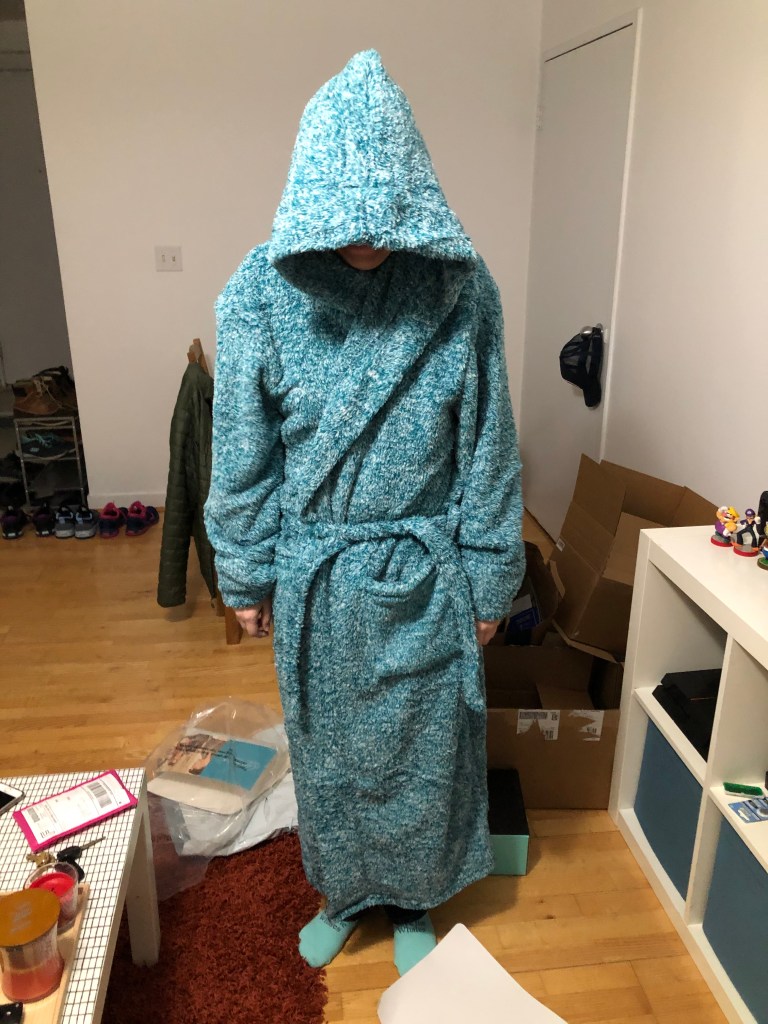
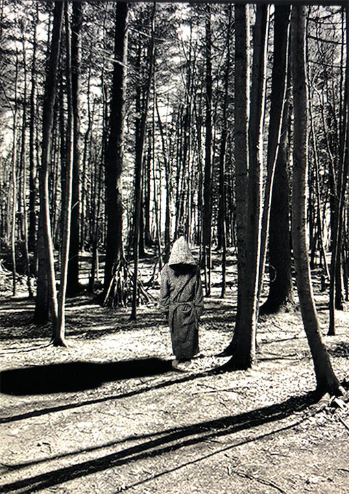
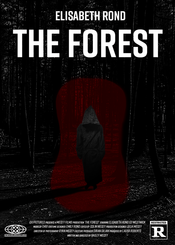
Putting together the poster, I paid a lot of attention to the perspective and dominance of the frame. The poster is laid out as if you are in the forest standing in front of the person. The person in the foreground is my girlfriend in her new robe, with a picture of the forest as the background. The pictures are taken in the middle of the day, so I made them black and white to be more dramatic. To give it more texture, I duplicated the background with the soft light effect to feel more shadowy. Part of the creative process was planning out what I wanted the look to be, and the other part came from experimenting around with the different tools.
Another aspect of the depth I paid attention to was the shadowing in the poster. For the person, I added a drop shadow and adjusted it to match the other shadows in the foreground. The poster is also center balanced yet your eye is drawn to the figure in the center.
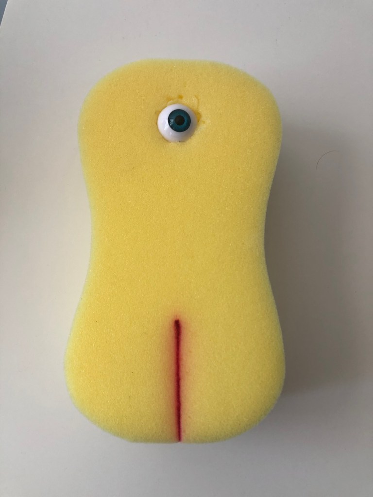
At the start of the process, the poster was lighter and had a more vintage look to it. I added a filter to make the poster look like an old photo, but I liked having it be more dramatic with the black and white. Another feature that came about through the design process was the red portal. For her nursing school, my girlfriend was given a yellow sponge to practice on at home due to COVID. I thought it would be fun to have this in the background as a looming figure, but after messing with layer effects it had a transparent look. It is just enough to see the trees in the background, but with the deep red, it catches the eye.
For the text, I wanted a bold font that hits well. For that, I choose Rift in bold for the title and in italic for the credits.
The main goal of my posture was not to be something that jumps out at you. I wanted it to be horrific in a relatable kind of way, that anyone could be walking through the forest at night and stumble upon this hooded figure. I’m proud of what I created and the effect it has.
Works Cited:
Landa, R. (2019). Graphic design solutions (6th ed.). Boston, MA: Cengage.

Leave a comment