For my abstract art piece, I took influence by the work of abstract-expressionist Hans Hofmann. I have always connected with Hofmann’s use of bold colors and geographic shapes for his works. One of my favorite pieces by Hofmann is his 1959 work Pompeii. The piece uses a lot of different techniques for depth and hierarchy. The way the shapes are aligned helps the eyes from one to the next. In her video on depth in graphic design, Callahan discusses the concept of superposition in depth. Superposition follows that a closer object will layer over an object that is farther away. Some of the shapes look to be overlapping, but some of the shapes have a small amount of space next to them. The shapes closer to the bottom of the frame are partially covering up the streak of blue paint, so they appear closer than the images that are towards the top. The images towards the top are also smaller, so they appear farther away compared to the larger shapes. There is no sense of shadowing in the piece, as the shapes appear two-dimensionally and cast no shadow.
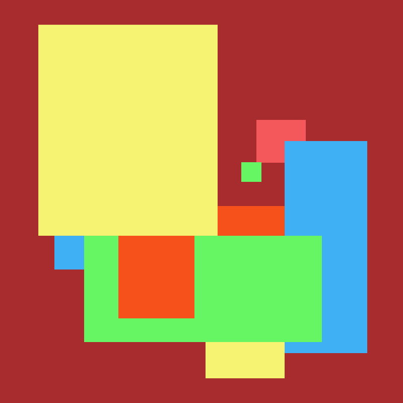
For my piece, I took from Hofmann’s techniques with color and shapes. I then applied concepts of superposition and the golden mean hierarchy. My piece is made up of various shapes of different colors. The shapes are on deep red background as to pop from the background. Using the tools in Photoshop, I wanted the lines of each of the shapes to be clear and crisp. I also chose colors that would stand out on screen.
To start I wanted the shapes to cover each other up as they transition to the next. Pompeii has both overlapping and adjacent shapes, and I used the adjacent shapes as balance. This creates the depth of the shapes covering each other up. In his presentation on hierarchy in graphic design, Fontana highlights many methods for analyzing hierarchy in the design. One method is the golden mean. The golden mean technique also helps to have your eye start at the larger rectangle and work your way around to the smaller one. Given the size of the larger shapes, it also helps to show dominance as the shapes flow to each other. I also used repetition of the colors for smaller shapes to help balance out the larger ones. In Chapter 2 of Graphic Design Solutions, Landa discusses how the repetition of color and shapes can help unify a design. The repetition of the shapes helps unify the piece in a modern way.
My main focus for this piece was to focus on hierarchy and to get where I want the audience to look first. I want them to start at the larger yellow shape and flow through the rest of the shapes. Finally, they end in a small green shape. In a way, the shapes are like a set of steps that start and end at the same point but continue in the same way. The shapes are also aligned so there is the same amount of border space between the shapes. I also wanted to create depth by overlapping each of the shapes over each other. At the same time, additional shapes next to them help balance out the overlapping.
With a lot of abstract art, it is surprising how much thought you put into it even though it is only some shapes or color. Applying the concepts of hierarchy and depth makes the pieces stand out in a lot of different ways.
Works Cited:
Callahan, E. (2021, January 25). Human Perception [MP4]. Hamden: Quinnipiac University.
Fontana, A. (n.d.). Intro to Composition [PPT]. Bowling Green: Bowling Green State University.
Landa, R. (2019). Chapter 2: Quickstart: Graphic Design Solutions. In Graphic design solutions (6th ed., pp. 19-34). Boston, MA: Cengage.
Tate. (1970, January 01). ‘Pompeii’, Hans Hofmann, 1959. Retrieved February 01, 2021, from https://www.tate.org.uk/art/artworks/hofmann-pompeii-t03256

Leave a comment